Building TUI Applications with Delphi and DMVCFramework
TUI: not a step backwards
If you have been following DMVCFramework’s recent development, you already know that console applications are living a second life. In the previous post on console colors, I introduced the low-level ANSI API — the Fore, Back, and Style records — and the Gin-style HTTP log renderer. That was the foundation.
This post is about the building on top of it: the full TUI library built into MVCFramework.Console.pas.
TUI stands for Text User Interface. It is the world of htop, lazygit, k9s, and every CLI tool that uses arrow keys, colored boxes, and progress bars. These applications are not “simple console programs” — they are rich, interactive interfaces that happen to run in a terminal.
With DMVCFramework 3.5.0 Silicon, Delphi developers now have a complete, cross-platform TUI toolkit:
- Colored text output with alignment
- Interactive menus navigated with arrow keys
- Animated spinners with 10 styles
- Determinate and indeterminate progress bars
- Tables with static display and interactive row selection
- Bordered boxes with optional titles
- Cursor control: hide, show, save, restore, move
- Keyboard input handling including special keys
- A global theme system
Everything in a single unit — MVCFramework.Console — with zero dependencies on the rest of the framework. You can copy it into any Delphi console project and use it immediately.
Setup
Add MVCFramework.Console to your uses clause. For full Unicode support (spinner frames, box-drawing characters, emoji), call EnableUTF8Console at the start of your program:
program MyTUIApp;
{$APPTYPE CONSOLE}
uses
  System.SysUtils,
  MVCFramework.Console;

begin
  EnableUTF8Console;  // Required for box chars, spinners with emoji, etc.
  // ... your code here
end.
On Windows, EnableUTF8Console calls SetConsoleOutputCP(CP_UTF8). On Linux it is a no-op since UTF-8 is the default. If you also plan to use the ANSI color primitives (Fore, Back, Style) directly with WriteLn, also call EnableANSIColorConsole. However, all high-level functions in this library call it internally, so most of the time you do not need to worry about it.
ANSI colors: the colorama approach (Fore / Back / Style)
MVCFramework.Console ships with two complementary color systems. The first — covered in the previous post — is a low-level ANSI API modelled after Python’s colorama library. It is worth revisiting here because it is an essential tool for any TUI application, and it composes naturally with everything else in this unit.
The API consists of three records with string constants:
| Record | Purpose | Example |
|---|---|---|
Fore |
Foreground (text) color | Fore.Red, Fore.Green, Fore.Cyan |
Back |
Background color | Back.DarkBlue, Back.DarkRed |
Style |
Text style and reset | Style.Bright, Style.Dim, Style.ResetAll |
Each constant is a raw ANSI escape sequence string. Colors compose via the + operator, and Style.ResetAll terminates a colored segment. Call EnableANSIColorConsole once at startup (idempotent, no-op on Linux):
EnableANSIColorConsole;
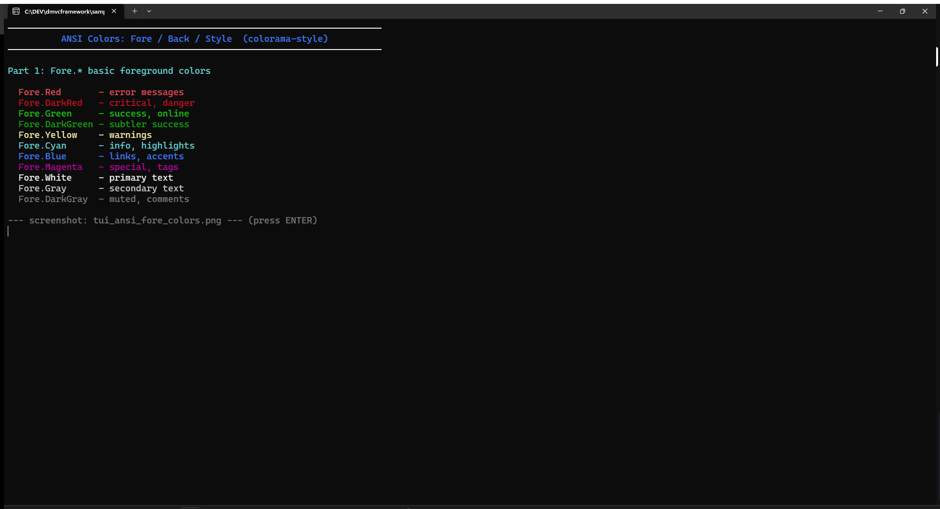
// Basic foreground colors
WriteLn(Fore.Red + 'Error: connection refused' + Style.ResetAll);
WriteLn(Fore.Green + 'OK: server started on :8080' + Style.ResetAll);
WriteLn(Fore.Yellow + 'Warning: cache miss rate 67%' + Style.ResetAll);
WriteLn(Fore.Cyan + 'Info: using config.env' + Style.ResetAll);
WriteLn(Fore.DarkGray + '# debug output' + Style.ResetAll);
Combining foreground, background, and style
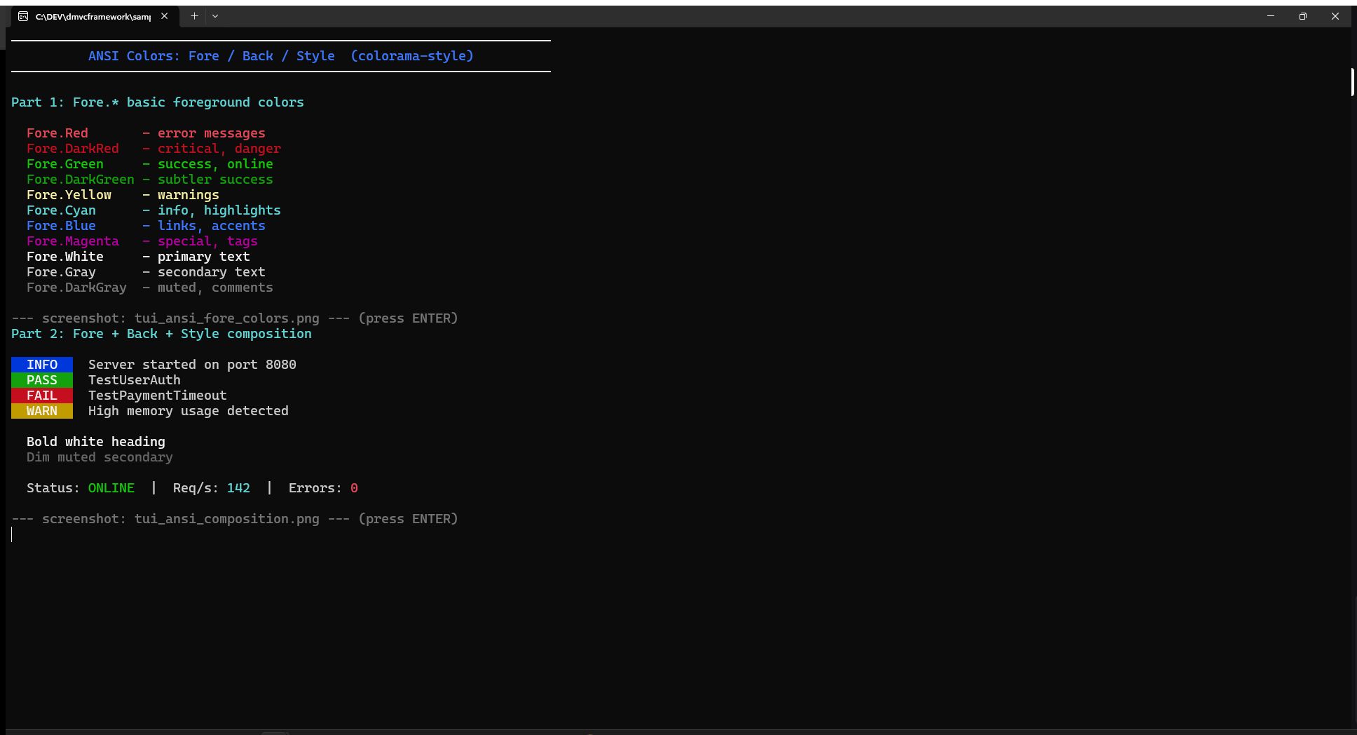
The real power is composition. Since constants are plain strings, any combination is a single concatenation:
// Foreground + background
WriteLn(Fore.White + Back.DarkBlue  + '  INFO  ' + Style.ResetAll + ' Server started');
WriteLn(Fore.White + Back.DarkGreen + '  PASS  ' + Style.ResetAll + ' TestUserAuth');
WriteLn(Fore.White + Back.DarkRed   + '  FAIL  ' + Style.ResetAll + ' TestPaymentTimeout');
WriteLn(Fore.White + Back.DarkYellow + '  WARN  ' + Style.ResetAll + ' High memory usage');

// Style modifiers
WriteLn(Style.Bright + Fore.White + 'Bold white heading' + Style.ResetAll);
WriteLn(Style.Dim  + Fore.Gray  + 'Muted secondary text' + Style.ResetAll);

// Mixed inline
WriteLn(
  'Status: ' + Fore.Green + 'ONLINE'  + Style.ResetAll +
  '  |  Req/s: ' + Fore.Cyan + '142' + Style.ResetAll +
  '  |  Errors: ' + Fore.Red + '0'   + Style.ResetAll
);
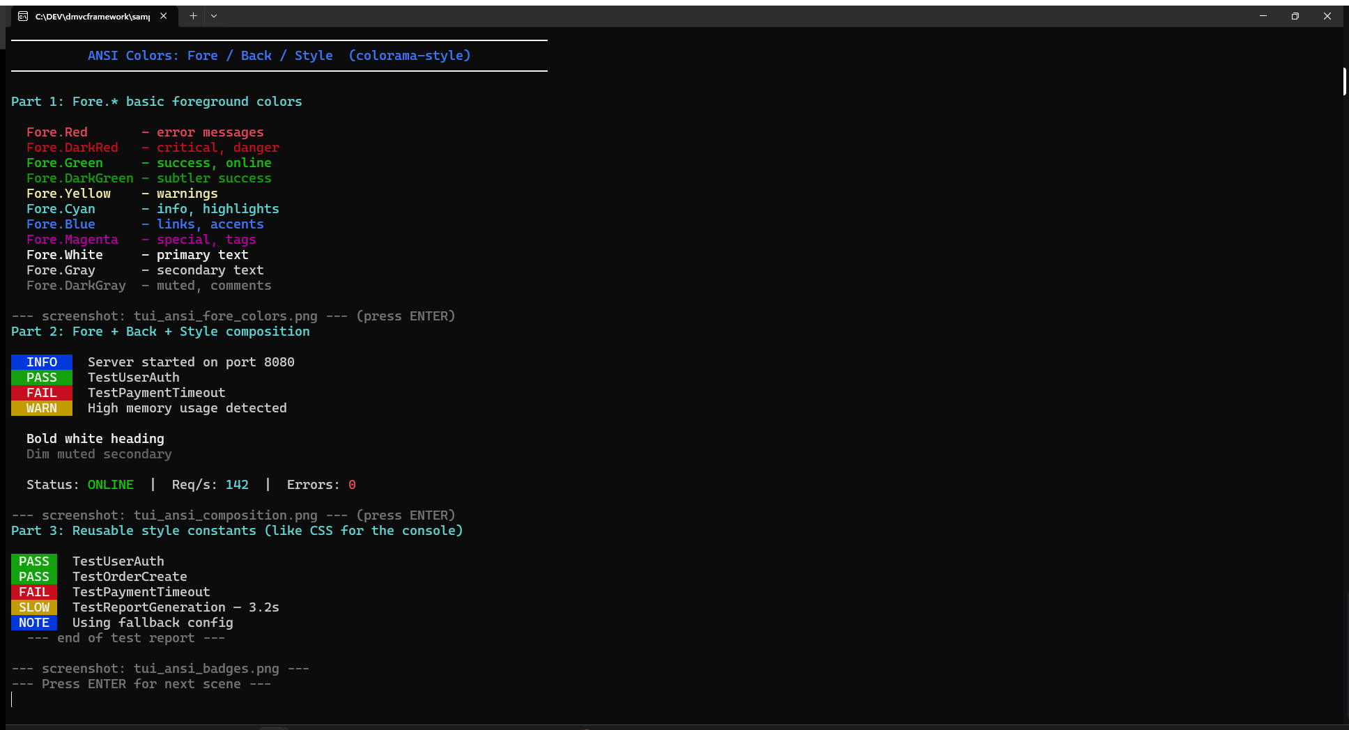
Reusable style constants (like CSS for the console)
Rather than repeating Fore.White + Back.DarkGreen everywhere, define named constants once. The compiler resolves them at compile time — zero runtime overhead:
const
  BADGE_OK   = Fore.White + Back.DarkGreen;
  BADGE_FAIL = Fore.White + Back.DarkRed;
  BADGE_WARN = Fore.White + Back.DarkYellow;
  BADGE_INFO = Fore.White + Back.DarkBlue;
  MUTED      = Fore.DarkGray;
  RESET      = Style.ResetAll;

// Clean, readable code:
WriteLn(BADGE_OK   + ' PASS ' + RESET + '  TestUserAuth');
WriteLn(BADGE_FAIL + ' FAIL ' + RESET + '  TestPaymentTimeout');
WriteLn(BADGE_WARN + ' SLOW ' + RESET + '  Query took 3.2s');
WriteLn(BADGE_INFO + ' NOTE ' + RESET + '  Using fallback config');
WriteLn(MUTED      + '--- end of report ---' + RESET);
When to use Fore/Back/Style vs TConsoleColor
The two systems are complementary, not competing:
Use Fore / Back / Style when… |
Use TConsoleColor / WriteLine when… |
|---|---|
You need inline coloring within a WriteLn |
You want full-line colored output |
| You are building badges or log prefixes | You are using Box, Table, Menu (theme-aware) |
| You want compile-time style constants | You want the global ConsoleTheme to apply |
You need Style.Bright or Style.Dim |
You need background color from the theme |
Both systems coexist. A typical TUI application uses Fore/Back/Style for custom inline text and relies on TConsoleColor-based functions for the structural widgets (boxes, tables, menus).
Text output
The color palette
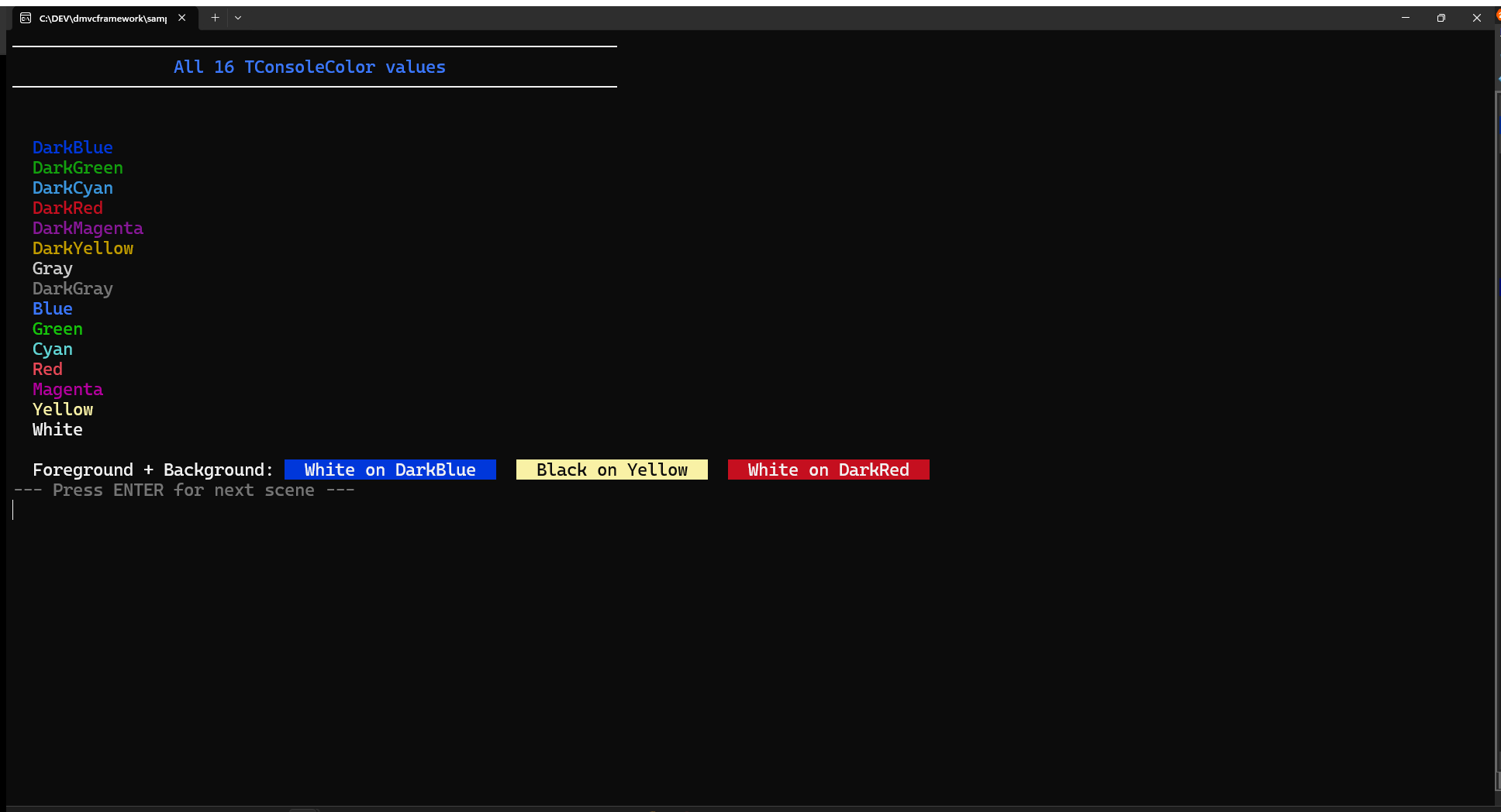
The library defines TConsoleColor, a 17-value enumeration covering the classic 16 terminal colors plus UseDefault (inherits from the active theme):
Black, DarkBlue, DarkGreen, DarkCyan, DarkRed, DarkMagenta,
DarkYellow, Gray, DarkGray, Blue, Green, Cyan, Red, Magenta,
Yellow, White, UseDefault
These map to the classic Windows Console API on Windows and to ANSI codes on Linux. The names are identical on both platforms: Green is always green, Red is always red.
WriteLine and WriteColoredText
The simplest way to output colored text:
// Plain text (uses terminal defaults)
WriteLine('Starting server initialization...');

// Text with foreground color
WriteLine('Server started successfully', Green);

// Text with foreground and background
WriteLine(' CRITICAL ', White, DarkRed);

// Inline colored segment (no newline)
WriteColoredText('[INFO] ', Cyan);
WriteLine('Listening on port 8080', White);
WriteColoredText saves and restores the current colors automatically, so it is safe to nest or call in sequence without worrying about color leakage.
Aligned text
WriteAlignedText pads text to a fixed width with configurable alignment:
// Center a title in a 80-char wide area
WriteAlignedText('DMVCFramework Server', 80, taCenter, Yellow);

// Right-align a value
WriteAlignedText('v3.5.0', 80, taRight, DarkGray);

// Left-align with color
WriteAlignedText('Status: ONLINE', 80, taLeft, Green);
The three alignment modes — taLeft, taCenter, taRight — cover all layout needs. The Width parameter controls the output column width, not the string width: shorter strings are padded, longer strings are truncated.
CenterInScreen is a convenience shortcut that centers a string in the physical console window:
CenterInScreen('Press any key to continue');
It reads the current console size with GetConsoleSize and computes the correct GotoXY coordinates automatically.
Status messages
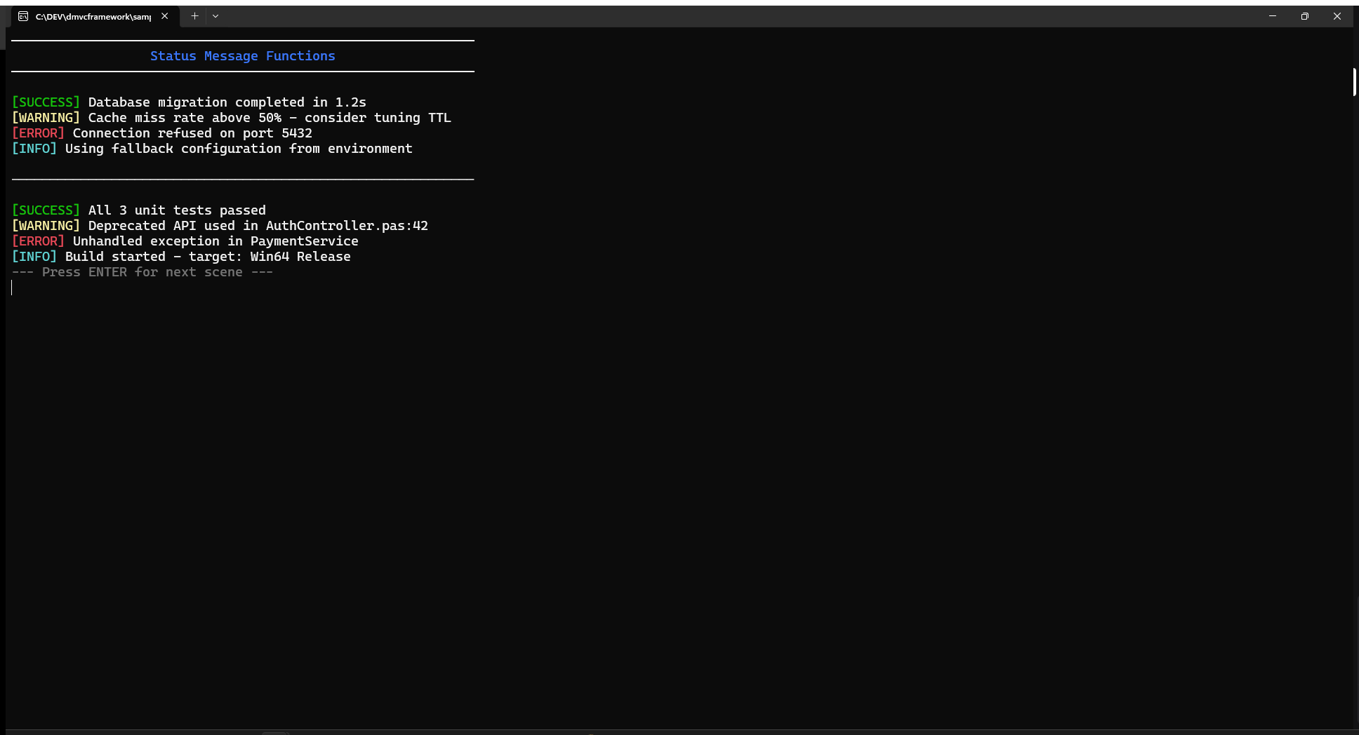
Four predefined status functions produce consistently styled output:
WriteSuccess('Database migration completed in 1.2s');
WriteWarning('Cache miss rate above 50% — consider tuning TTL');
WriteError('Connection refused on port 5432');
WriteInfo('Using fallback configuration from environment');
Each produces a solid-background badge followed by themed message text (ConsoleTheme.Text):
| Function | Badge | Badge style |
|---|---|---|
WriteSuccess |
[SUCCESS] |
Black on Green |
WriteWarning |
[WARNING] |
Black on Yellow |
WriteError |
[ERROR] |
White on Red |
WriteInfo |
[INFO] |
White on Blue |
Headers and separators
WriteHeader produces a centered title framed by horizontal lines, using the active box-drawing character set:
WriteHeader('Database Migration Tool');
WriteHeader('Configuration Summary', 60);
WriteHeader('Results', 60, Green);  // Custom color
The default width is 80 columns. The horizontal line character adapts to ConsoleTheme.BoxStyle (see the Themes section below).
WriteSeparator draws a simple horizontal line — useful to visually divide output sections:
WriteSeparator;          // 60 dashes
WriteSeparator(80);      // 80 dashes
WriteSeparator(40, '='); // 40 equals signs

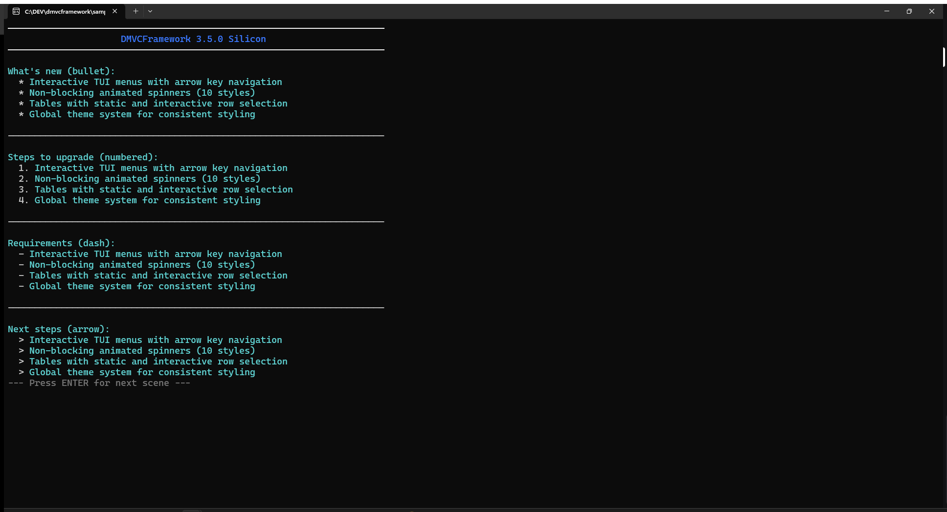
Formatted lists
WriteFormattedList renders a titled list with configurable bullet style:
var Features: TStringArray;
SetLength(Features, 4);
Features[0] := 'Interactive menus with arrow key navigation';
Features[1] := 'Non-blocking spinners on background thread';
Features[2] := 'Tables with static and interactive display';
Features[3] := 'Global theme system';

WriteFormattedList('New in DMVCFramework 3.5.0:', Features, lsBullet);
WriteFormattedList('Steps to upgrade:', Features, lsNumbered);
WriteFormattedList('Features removed:', Features, lsDash);
WriteFormattedList('Next steps:', Features, lsArrow);
The four list styles:
| Style | Prefix |
|---|---|
lsBullet |
* |
lsNumbered |
1. |
lsDash |
- |
lsArrow |
> |
Boxes
The Box function renders a bordered content area, auto-sizing to the content width by default:
// Simple box, no title, default width (60)
Box(['Server: ONLINE', 'Database: CONNECTED', 'Memory: 65%']);

// Box with title
Box('System Status', ['Server: ONLINE', 'Database: CONNECTED']);

// Box with title and custom width
Box('WARNING', ['Cache server not responding', 'Check network connection'], 50);
Box content is automatically left-padded inside the border. The border characters adapt to ConsoleTheme.BoxStyle.
For fine-grained drawing control, use the low-level DrawBox primitive directly:
// Draw a 40x10 box starting at column 5, row 3
DrawBox(5, 3, 40, 10, bsDouble, 'Debug Panel');
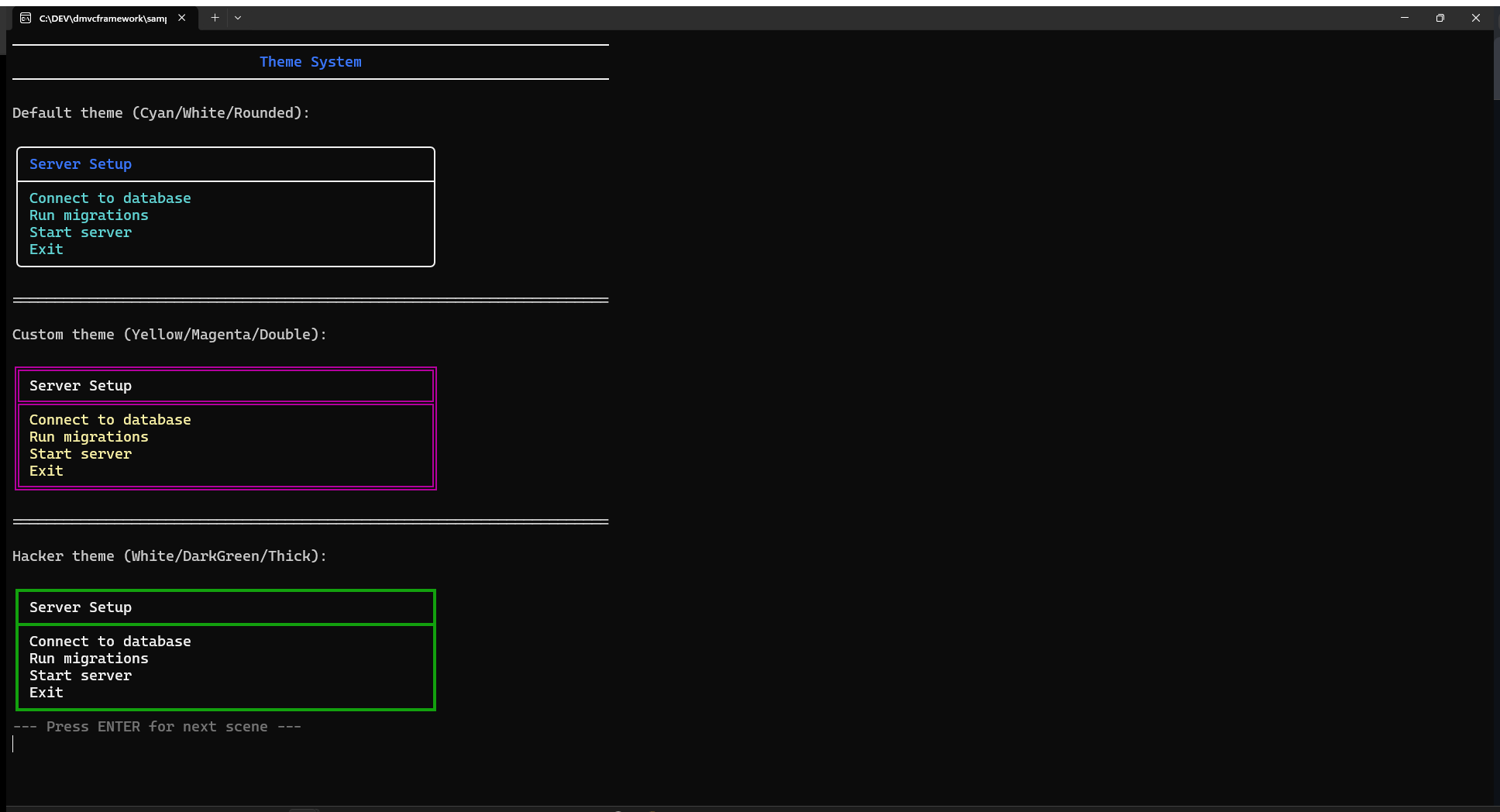
Box styles
Four border styles are available via TBoxStyle:
DrawBox(0, 0, 30, 5, bsSingle,  'Single');   // ┌─┐ │ └─┘
DrawBox(0, 6, 30, 5, bsDouble,  'Double');   // ╔═╗ ║ ╚═╝
DrawBox(0, 12, 30, 5, bsRounded, 'Rounded'); // ╭─╮ │ ╰─╯
DrawBox(0, 18, 30, 5, bsThick,   'Thick');   // ┏━┓ ┃ ┗━┛
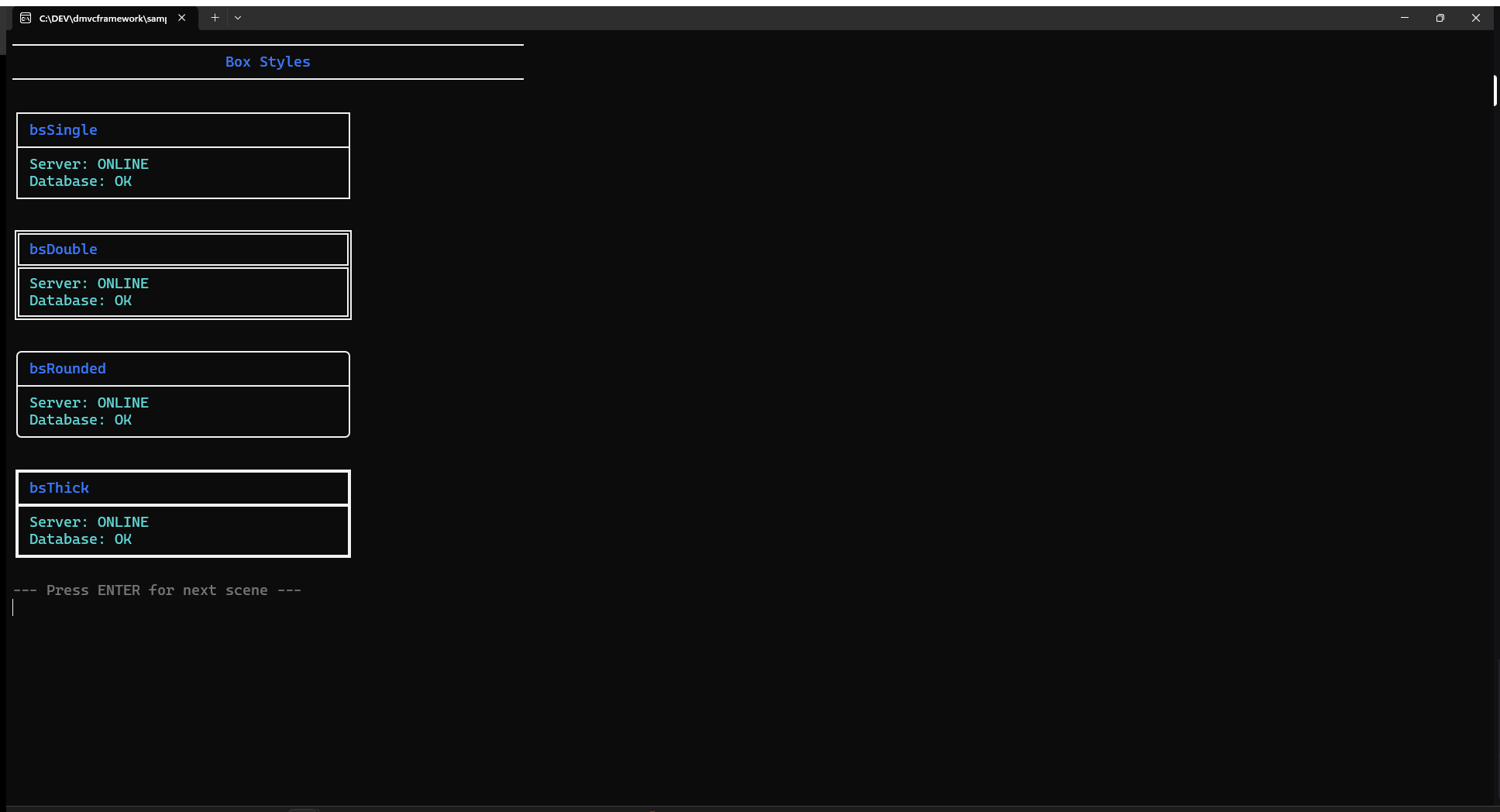
The default box style for all high-level functions (Box, Menu, Table) is controlled by ConsoleTheme.BoxStyle. Changing it once affects all widgets:
ConsoleTheme.BoxStyle := bsDouble;
Box('Now everything uses double borders', ['Item 1', 'Item 2']);
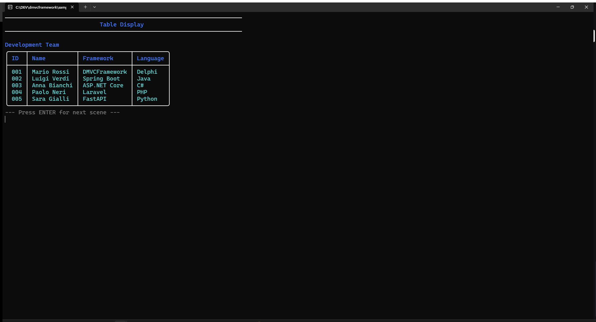
Tables
Static table
Table renders a formatted table with auto-sized columns:
var
  Headers: TStringArray;
  Data: TStringMatrix;

SetLength(Headers, 4);
Headers[0] := 'ID'; Headers[1] := 'Name';
Headers[2] := 'Framework'; Headers[3] := 'Language';

SetLength(Data, 3);

SetLength(Data[0], 4);
Data[0] := ['001', 'Mario Rossi', 'DMVCFramework', 'Delphi'];

SetLength(Data[1], 4);
Data[1] := ['002', 'Luigi Verdi', 'Spring Boot', 'Java'];

SetLength(Data[2], 4);
Data[2] := ['003', 'Anna Bianchi', 'ASP.NET Core', 'C#'];

// Without title
Table(Headers, Data);

// With title
Table(Headers, Data, 'Development Team');
Column widths are computed automatically: each column is as wide as its widest cell (header or data), plus 2 characters of internal padding. The header row is rendered with ConsoleTheme.HighlightText for visual distinction.
Interactive table
TableMenu turns a table into an interactive selector navigated with arrow keys:
var SelectedRow: Integer;

SelectedRow := TableMenu('Select a Developer', Headers, Data);

if SelectedRow >= 0 then
  WriteSuccess('You selected: ' + Data[SelectedRow][1])
else
  WriteWarning('Selection cancelled');
The selected row is highlighted using ConsoleTheme.Highlight (background) and ConsoleTheme.HighlightText (text). Navigation keys:
| Key | Action |
|---|---|
| ↑ / ↓ | Move selection up/down |
| Enter | Confirm selection, return row index |
| Escape | Cancel, return -1 |
The cursor is hidden automatically during interaction and restored on exit.
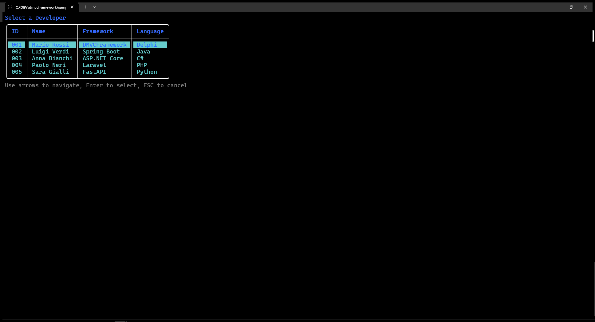
You can pre-select a row:
SelectedRow := TableMenu('Select', Headers, Data, 2); // Start with row 2 selected
Interactive menus
Menu displays a keyboard-navigable list enclosed in a box. It appears at the current cursor position and cleans up after itself when the user makes a selection or presses Escape.
var
  Items: TStringArray;
  Selected: Integer;

SetLength(Items, 5);
Items[0] := 'Start Server';
Items[1] := 'Stop Server';
Items[2] := 'View Logs';
Items[3] := 'Settings';
Items[4] := 'Exit';

// Without title
Selected := Menu(Items);

// With title
Selected := Menu('Main Menu', Items);

// With title and pre-selected item
Selected := Menu('File Menu', Items, 2); // Start with 'View Logs' selected
Return value: the index of the selected item (0-based), or -1 if the user pressed Escape.
Navigation:
| Key | Action |
|---|---|
| ↑ | Move up (wraps around) |
| ↓ | Move down (wraps around) |
| Enter | Confirm |
| Escape | Cancel |
The selected item is rendered with inverted colors (background highlight). The menu auto-adjusts its width to fit the longest item plus padding. If the menu would overflow the bottom of the terminal, it is repositioned upward automatically.
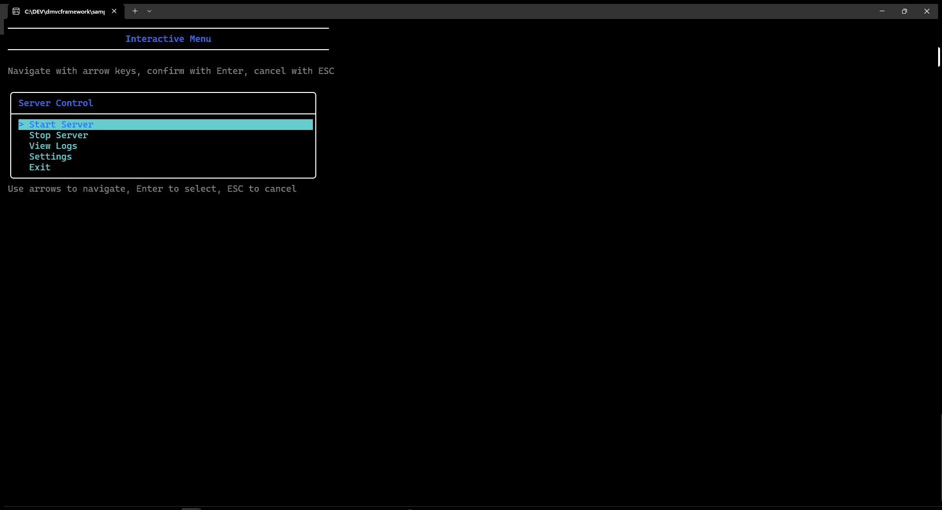
// Practical example: main dispatch loop
while True do
begin
  Selected := Menu('Server Control', ['Start', 'Stop', 'Restart', 'Quit']);
  case Selected of
    0: StartServer;
    1: StopServer;
    2: begin StopServer; StartServer; end;
    3, -1: Break;
  end;
end;
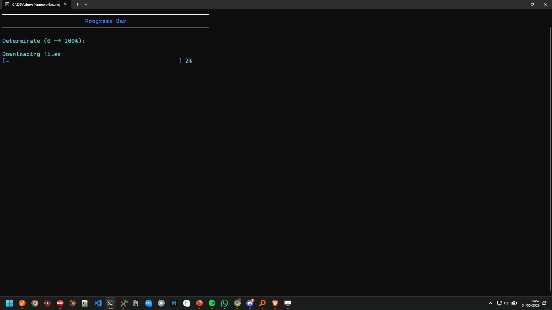
Progress bars
Determinate progress
Progress with a MaxValue > 0 produces a determinate progress bar:
var
  P: IProgress;
  I: Integer;

P := Progress('Downloading files', 100);
for I := 1 to 100 do
begin
  P.Update(I);
  Sleep(20); // Simulate work
end;
P := nil; // Calls Complete automatically via destructor
The bar renders as [==== ] 45%. The filled portion is calculated as (Current * Width) div MaxValue. Default bar width is 50 characters.
The IProgress interface exposes:
| Method | Description |
|---|---|
Update(Value) |
Set current value (absolute) |
Increment(Amount) |
Increment by Amount (default 1) |
SetMessage(Msg) |
Update the title label |
Complete |
Mark as done, print “Done!” in green |
Setting P := nil triggers the destructor, which calls Complete if not already done. This means wrapping the progress in a try/finally block is optional — the cleanup is guaranteed.
// Increment style
P := Progress('Processing records', 1000);
for I := 1 to 1000 do
begin
  ProcessRecord(I);
  P.Increment;
end;
Indeterminate progress
Progress with MaxValue = 0 produces an indeterminate spinner inside a bracket pair:
P := Progress('Loading configuration');
// Do work...
while StillLoading do
begin
  P.Update(0); // Advance the spinner
  Sleep(50);
end;
P.Complete;
The spinner inside the [|] bracket cycles through |/-\ characters. Call Update periodically to advance the animation. This is a blocking pattern — the spinner advances only when you call Update. For a fully non-blocking spinner, use Spinner instead (see below).
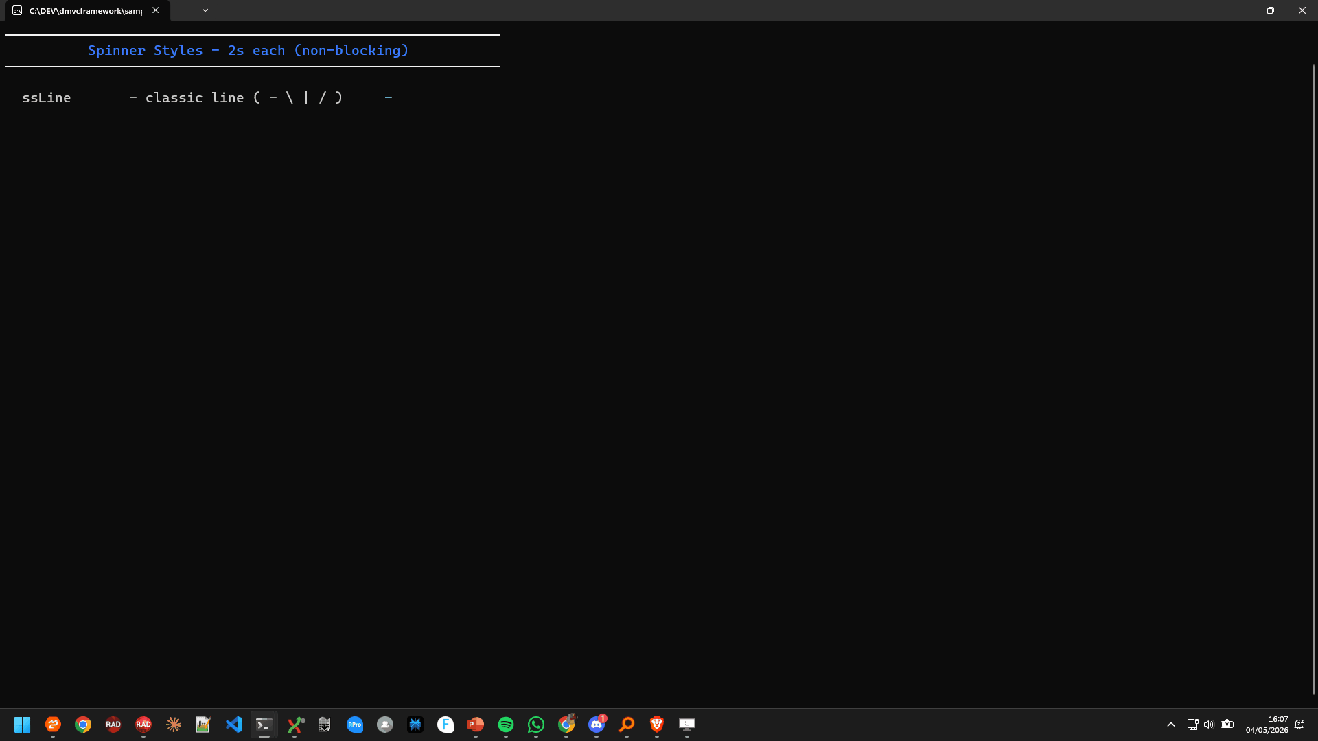
Spinners
The Spinner function creates a background-threaded, non-blocking animated spinner. Your main thread continues working while the spinner animates independently:
var S: ISpinner;

S := Spinner('Loading data', ssLine, DarkGray);
// Do your work here — spinner animates on its own
FetchRemoteData;
S.Hide; // Or: S := nil (calls destructor → Hide)
Releasing the interface (setting to nil) also calls Hide, which stops the thread and erases the spinner from the terminal.
The 10 spinner styles
TSpinnerStyle offers 10 animation styles:
| Style | Characters | Interval | Description |
|---|---|---|---|
ssLine |
-\│/ |
100ms | Classic terminal spinner |
ssDots |
Braille patterns | 80ms | Smooth dot animation |
ssBounce |
Braille bounce | 80ms | Bouncing dot |
ssGrow |
Block elements | 120ms | Growing bar |
ssArrow |
Arrow characters | 100ms | Rotating arrow |
ssCircle |
Circle quarters | 100ms | Rotating circle |
ssClock |
🕐🕑🕒… | 200ms | 12 clock faces |
ssEarth |
🌍🌎🌏 | 200ms | Globe rotation |
ssMoon |
🌑🌒🌓… | 200ms | 8 moon phases |
ssWeather |
🌤🌧⛈… | 200ms | Weather icons |
Each style automatically uses the appropriate animation interval. You do not need to tune Sleep values.
// Line spinner (default)
S := Spinner(ssLine);

// Dots with message
S := Spinner('Connecting to database', ssDots, Cyan);

// Earth rotation, no message
S := Spinner(ssEarth);

// Moon phases with custom color
S := Spinner('Syncing', ssMoon, Blue);
Spinner inside a work loop
A common pattern: show a spinner while an async operation runs, then replace it with a status message.
var S: ISpinner;
begin
  S := Spinner('Connecting to server', ssDots, Cyan);
  try
    ConnectToServer; // Blocks, but spinner runs on a separate thread
    S.Hide;
    WriteSuccess('Connected successfully');
  except
    S.Hide;
    WriteError('Connection failed: ' + E.Message);
  end;
end;
Confirm and Choose
Confirm
Confirm prompts the user for a yes/no answer with an optional default:
// Default: Yes
if Confirm('Do you want to continue?') then
  StartOperation
else
  Writeln('Aborted.');

// Default: No (safer for destructive actions)
if Confirm('Delete all records?', False) then
  DeleteAllRecords;
The prompt shows [Y/N] (Y): or [Y/N] (N): depending on the default. Pressing Enter without typing accepts the default.
Choose
Choose presents a numbered list and reads a numeric input. Useful when the option count is small and you want a simpler UX than a full arrow-key menu:
var
  Options: TStringArray;
  Choice: Integer;

SetLength(Options, 3);
Options[0] := 'Fast Mode';
Options[1] := 'Normal Mode';
Options[2] := 'Safe Mode';

Choice := Choose('Select processing mode:', Options);
if Choice >= 0 then
  WriteSuccess('You chose: ' + Options[Choice]);
Output:
Select processing mode:
  [1] Fast Mode
  [2] Normal Mode
  [3] Safe Mode
Your choice: _
Returns the 0-based index of the selected option, or -1 if the input was invalid.
Cursor control
Hide and show
When drawing interactive UI elements (menus, progress bars, spinners), hiding the cursor eliminates the visual noise of a blinking caret jumping around the screen:
HideCursor;
try
  DrawDashboard;
  WaitForKey;
finally
  ShowCursor; // Always restore in a finally block
end;

The high-level functions (Menu, TableMenu, Spinner) manage cursor visibility internally. You need to call HideCursor manually only when using low-level drawing primitives directly.
GotoXY
GotoXY moves the cursor to an absolute column/row position (0-based):
// Move to column 10, row 5
GotoXY(10, 5);
Write('Value: ');
GotoXY(18, 5);
Write(CurrentValue:6:2);
This is the foundation of all in-place screen updates. Combined with GetCursorPosition, you can record a position and return to it later:
var Pos: TMVCConsolePoint;

Pos := GetCursorPosition;
Write('Processing...');
DoSomeWork;
GotoXY(Pos.X, Pos.Y);
Write('Done!         '); // Overwrite previous text
Save and restore cursor position
SaveCursorPosition and RestoreCursorPosition store/restore coordinates in a global variable:
SaveCursorPosition;
// ... draw something elsewhere
RestoreCursorPosition;
Write('Back here!');
Note: these use a single global storage slot, so they are not re-entrant. For complex layouts with multiple saved positions, use GetCursorPosition / GotoXY directly.
Drawing primitives
For layouts that require more than the high-level widgets, you can use the raw drawing functions:
DrawBox
Draws a box at absolute coordinates without the padding and color management of the high-level Box:
DrawBox(5, 2, 40, 10, bsSingle, 'Panel Title');
DrawBox(50, 2, 30, 10, bsDouble);
Parameters: X, Y (top-left corner), Width, Height, Style (optional), Title (optional, centered in the top border).
DrawHorizontalLine and DrawVerticalLine
// Draw a 60-char separator at row 12
DrawHorizontalLine(0, 12, 60, bsSingle);

// Draw a vertical divider at column 40, from row 2, 20 chars tall
DrawVerticalLine(40, 2, 20, bsSingle);
Use bsUseDefault to inherit the style from ConsoleTheme.BoxStyle.
ClearRegion
Clears a rectangular area by overwriting it with spaces:
// Clear a 40x10 region starting at (5, 3)
ClearRegion(5, 3, 40, 10);
Useful for refreshing parts of the screen without calling ClrScr (which clears everything and repositions the cursor at 0, 0).
Themes
All high-level widgets read their colors and box style from the global ConsoleTheme record. The type TConsoleColorStyle holds five ANSI string slots and a box style:
type
  TConsoleColorStyle = record
    Text:          string;         // Body text in boxes and tables
    Draw:          string;         // Box borders and separators
    Symbols:       string;         // List bullets and prefixes (usually dim)
    Highlight:     string;         // Selected item (solid background + bright fg)
    HighlightText: string;         // Headers, titles, and prompt labels
    BoxStyle:      TBoxStyle;
    Background:    TConsoleColor;  // Whole-screen background color for the theme
  end;
Each field is a raw ANSI escape string — the same kind produced by Fore.*, Back.*, and Style.*. You can compose them freely:
ConsoleTheme.Highlight := Back.DarkBlue + Fore.White + Style.Bright;
Predefined themes
Fourteen built-in theme constants are ready to use:
| Constant | Description |
|---|---|
ConsoleThemeDefault |
Cyan text, white borders, cyan solid highlight |
ConsoleThemeClassic |
Green text on black, classic terminal feel |
ConsoleThemeMatrix |
Bright green body, dark green borders, green highlight |
ConsoleThemeSunset |
Yellow/orange body, warm highlight |
ConsoleThemeOcean |
Blue body, cyan highlights, thick-box border |
ConsoleThemeMonochrome |
White/gray only, no color |
ConsoleThemeMagenta |
Magenta accents throughout |
ConsoleThemeAlert |
White text, gray borders, red solid highlight |
ConsoleThemeNavy |
DarkBlue background, double-box, Turbo Pascal / classic IDE aesthetic |
ConsoleThemeForest |
DarkGreen background, single-box, vintage terminal |
ConsoleThemeSlate |
DarkGray background, rounded-box, softer dark mode |
ConsoleThemePaper |
Gray background, single-box, retro light terminal |
ConsoleThemeBurgundy |
DarkRed background, thick-box, dramatic high-contrast |
ConsoleThemeMidnight |
DarkCyan background, rounded-box, teal terminal |
Apply a theme with SetConsoleTheme:
SetConsoleTheme(ConsoleThemeMatrix);
Box('System Status', ['Server: ONLINE', 'Database: CONNECTED']);

SetConsoleTheme(ConsoleThemeAlert);
Box('CRITICAL', ['Failure detected', 'Check logs immediately']);
Changing the theme affects all subsequent calls to Box, Table, Menu, WriteHeader, WriteFormattedList, and similar functions. SetConsoleTheme also applies the theme’s Background color. A ClrScr after the call paints the entire screen with the theme background, which is particularly visible with the six new non-black-background themes.
Saving and restoring themes
Themes are a global variable. To switch temporarily, save and restore with a record assignment:
var SavedTheme: TConsoleColorStyle;

SavedTheme := ConsoleTheme;
SetConsoleTheme(ConsoleThemeAlert);
Box('ERROR', ['Critical failure detected']);
SetConsoleTheme(SavedTheme); // Restore
Deriving a custom theme
The cleanest way to customize is to copy a built-in theme and override individual fields:
var MyTheme: TConsoleColorStyle;

MyTheme              := ConsoleThemeMidnight;                          // start from Midnight
MyTheme.Highlight    := Back.Yellow + Fore.Black + Style.Bright;      // yellow highlight
MyTheme.HighlightText:= Fore.Yellow + Style.Bright;
MyTheme.BoxStyle     := TBoxStyle.bsThick;                            // thick border
SetConsoleTheme(MyTheme);
ClrScr; // paints the screen with the DarkCyan background from ConsoleThemeMidnight

Box('Custom Status', ['Server: ONLINE', 'Cache: OK']);
The ConsoleThemesDemo project in samples/console_themes_demo/ConsoleThemesDemo.dpr cycles through all fourteen built-in themes plus this custom derivation, letting you see every theme applied to menus, boxes, tables, progress bars, and lists.
Keyboard input
GetKey and GetCh
GetKey blocks until the user presses a key and returns an integer code:
- Printable characters:
Ord('A')= 65,Ord(' ')= 32, etc. - Special keys: values above 255, defined as named constants
var Key: Integer;

Key := GetKey;

if IsSpecialKey(Key) then
begin
  case Key of
    KEY_UP:    MoveUp;
    KEY_DOWN:  MoveDown;
    KEY_LEFT:  MoveLeft;
    KEY_RIGHT: MoveRight;
    KEY_ENTER: Confirm;
    KEY_ESCAPE: Cancel;
  end;
end
else
begin
  // Regular character
  ProcessChar(Chr(Key));
end;
GetCh is a shortcut that returns Char instead of Integer. For special keys it returns #0 (null character) — use GetKey if you need to distinguish arrow keys.
Special key constants
const
  KEY_UP    = 256 + 38;  // VK_UP
  KEY_DOWN  = 256 + 40;  // VK_DOWN
  KEY_LEFT  = 256 + 37;  // VK_LEFT
  KEY_RIGHT = 256 + 39;  // VK_RIGHT
  KEY_ESCAPE = 27;
  KEY_ENTER  = 13;
IsSpecialKey(KeyCode) returns True when KeyCode > 255, i.e., when the value represents an arrow key or other virtual key rather than a printable character.
Non-blocking key check
KeyPressed returns True if a key is waiting in the input buffer, without consuming it:
// Animated loop that exits on any keypress
while not KeyPressed do
begin
  UpdateAnimation;
  Sleep(50);
end;
Key := GetKey; // Consume the pending key
WaitForReturn
WaitForReturn blocks until the user presses Enter — a cleaner alternative to ReadLn for “press enter to continue” prompts:
WriteInfo('Review complete. Press ENTER to continue.');
WaitForReturn;
Terminal capabilities
Console size
GetConsoleSize returns the visible terminal window dimensions:
var Size: TMVCConsoleSize;

Size := GetConsoleSize;
WriteLn(Format('Terminal: %d x %d', [Size.Columns, Size.Rows]));
GetConsoleBufferSize returns the full buffer size (on Windows, the scroll buffer can be larger than the window). For TUI layouts, always use GetConsoleSize — you want the visible area.
Terminal detection
if IsTerminalCapable then
  StartInteractiveMode
else
  // Redirect to file — skip interactive features
  WritePlainOutput;

WriteLn('Running on: ' + GetTerminalName);
// Windows → 'Windows Console'
// Linux   → value of $TERM variable (e.g. 'xterm-256color')
Colors and ANSI
// Enable ANSI colors (needed before using Fore/Back/Style directly)
EnableANSIColorConsole;

// Check if ANSI is active
if IsANSIColorConsoleEnabled then
  WriteLn(Fore.Green + 'Colors active!' + Style.ResetAll);
Utility functions
ClrScr
Clears the entire console and moves the cursor to 0, 0. Use at the start of a screen to give a clean slate:
ClrScr;
WriteHeader('Server Control Panel');
Beep
Emits a system beep. Useful as an error audio signal:
if CriticalError then
begin
  Beep;
  WriteError('Critical failure!');
end;
On Windows it calls WinAPI.Windows.Beep(800, 200). On Linux it writes #7 to stdout.
FlashScreen
Briefly inverts the screen colors as a visual alert:
FlashScreen; // 100ms flash
WriteError('Invalid input');
On Linux this uses the ANSI reverse-video escape sequence. On Windows it inverts colors manually using FillConsoleOutputAttribute.
Color helpers
// Get the name of a color constant as a string
WriteLn(ColorName(Green)); // 'Green'
WriteLn(ColorName(DarkGray)); // 'DarkGray'

// Save/restore colors manually (lower-level than TConsoleColorStyle)
SaveColors;
TextColor(Red);
TextBackground(DarkBlue);
Write('Highlighted');
RestoreSavedColors;
SaveColors and RestoreSavedColors operate on a single global slot (same caveat as SaveCursorPosition). They are used internally by WriteColoredText and are rarely needed directly.
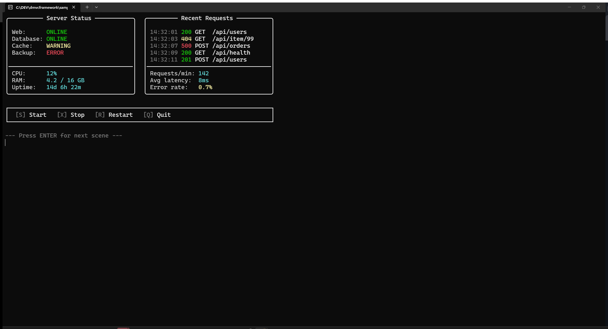
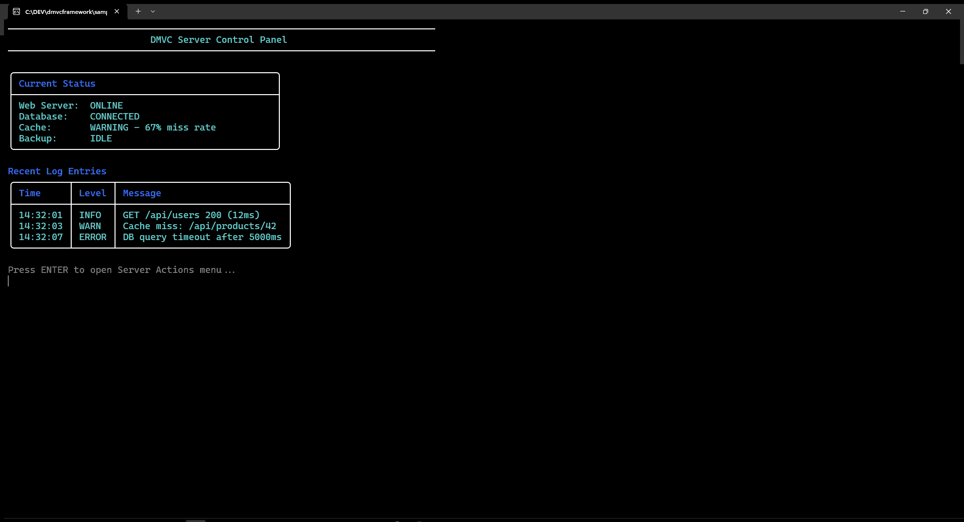
Putting it all together: a server dashboard
Here is a realistic example combining boxes, status messages, a spinner, progress, and a menu into a simple server control panel:
procedure RunServerPanel;
var
  Menu: Integer;
  S: ISpinner;
  P: IProgress;
  I: Integer;
  Data: TStringMatrix;
  Headers: TStringArray;
begin
  EnableUTF8Console;
  ClrScr;

  // Header
  WriteHeader('DMVC Server Control Panel', 80, Cyan);
  WriteLn;

  // Status box
  Box('Current Status', [
    'Web Server:  ONLINE',
    'Database:    CONNECTED',
    'Cache:       WARNING - 67% miss rate',
    'Backup:      IDLE'
  ], 50);
  WriteLn;

  // Log table
  SetLength(Headers, 3);
  Headers[0] := 'Time'; Headers[1] := 'Level'; Headers[2] := 'Message';

  SetLength(Data, 3);
  Data[0] := ['14:32:01', 'INFO',  'Request GET /api/users → 200 (12ms)'];
  Data[1] := ['14:32:03', 'WARN',  'Cache miss: /api/products/42'];
  Data[2] := ['14:32:07', 'ERROR', 'DB query timeout after 5000ms'];

  Table(Headers, Data, 'Recent Log Entries');
  WriteLn;

  // Main menu
  Menu := Menu('Server Actions', [
    'Restart Web Server',
    'Flush Cache',
    'Run Database Migration',
    'View Full Logs',
    'Exit'
  ]);

  case Menu of
    0: begin
         // Restart with spinner
         S := Spinner('Restarting web server', ssDots, Cyan);
         Sleep(2000);
         S.Hide;
         WriteSuccess('Web server restarted successfully');
       end;
    1: begin
         // Flush cache with progress
         P := Progress('Flushing cache entries', 100);
         for I := 1 to 100 do
         begin
           P.Update(I);
           Sleep(15);
         end;
         P := nil;
         WriteLn;
         WriteSuccess('Cache flushed: 4,832 entries removed');
       end;
    2: begin
         if Confirm('Run database migration? This may take several minutes.', False) then
         begin
           S := Spinner('Running migration', ssGrow, Yellow);
           Sleep(3000);
           S.Hide;
           WriteSuccess('Migration completed: 12 scripts applied');
         end
         else
           WriteInfo('Migration cancelled');
       end;
    -1, 4:
       WriteInfo('Goodbye!');
  end;
end;
Quick reference
| Category | Function / Type | Description |
|---|---|---|
| Setup | EnableUTF8Console |
Enable UTF-8 output (box chars, emoji) |
| Setup | EnableANSIColorConsole |
Enable ANSI sequences on Windows 10+ |
| Low-level color | Fore.Red, Back.Blue, Style.Bright |
Inline ANSI escape constants |
| Output | WriteLine(text, fg, bg) |
Full-line colored output |
| Output | WriteColoredText(text, color) |
Inline colored segment, no newline |
| Output | WriteAnsiText(ansi, text) |
Inline text with raw ANSI prefix, no newline |
| Output | WriteAnsiLine(ansi, text) |
Full-line text with raw ANSI prefix |
| Output | WriteAlignedText(text, width, align, color) |
Padded/aligned text |
| Status | WriteSuccess / WriteWarning / WriteError / WriteInfo |
Prefixed status messages |
| Layout | WriteHeader(title, width, color) |
Centered title with horizontal rules |
| Layout | WriteSeparator(width, char) |
Horizontal separator line |
| Layout | WriteFormattedList(title, items, style) |
Bulleted / numbered / dash / arrow list |
| Widgets | Box(title, lines, width) |
Bordered content box |
| Widgets | DrawBox(x, y, w, h, style, title) |
Raw box at absolute coordinates |
| Widgets | Table(headers, data, title) |
Static formatted table |
| Widgets | TableMenu(title, headers, data) |
Keyboard-navigable table, returns row index |
| Widgets | Menu(title, items, default) |
Keyboard-navigable menu, returns item index |
| Animation | Spinner(msg, style, color): ISpinner |
Background-threaded spinner (10 styles) |
| Animation | Progress(msg, maxValue): IProgress |
Determinate / indeterminate progress bar |
| Input | GetKey: Integer |
Blocking key read including special keys |
| Input | KeyPressed: Boolean |
Non-blocking key availability check |
| Input | WaitForReturn |
Block until Enter is pressed |
| Input | Confirm(msg, default): Boolean |
Y/N prompt |
| Input | Choose(title, options): Integer |
Numbered choice prompt |
| Cursor | HideCursor / ShowCursor |
Toggle cursor visibility |
| Cursor | GotoXY(x, y) |
Move to absolute column/row |
| Cursor | GetCursorPosition: TMVCConsolePoint |
Read current cursor coordinates |
| Screen | ClrScr |
Clear screen, cursor to 0,0 |
| Screen | ClearRegion(x, y, w, h) |
Clear rectangular area |
| Screen | GetConsoleSize: TMVCConsoleSize |
Visible terminal dimensions |
| Theme | ConsoleTheme: TConsoleColorStyle |
Global ANSI color slots and box style — apply with SetConsoleTheme |
Frequently asked questions
Does MVCFramework.Console require the full DMVCFramework to be installed?
No. The unit is self-contained with zero dependencies on the rest of the framework. Copy MVCFramework.Console.pas into any Delphi console project and add it to the uses clause. No packages, no BPL files, no IDE setup required.
Is MVCFramework.Console cross-platform?
Yes. The library compiles and runs on Windows 10+ and Linux with the same API. ANSI color support is native on Linux; on Windows it is enabled automatically via EnableANSIColorConsole. Box-drawing characters and emoji require EnableUTF8Console at startup.
What Delphi version is required?
Delphi 10 Seattle (D100) or later. The unit ships with DMVCFramework 3.5.0 Silicon and later.
How do I read arrow keys in a Delphi console application?
Use GetKey: Integer. Arrow keys return values above 255: KEY_UP = 256+38, KEY_DOWN = 256+40, KEY_LEFT = 256+37, KEY_RIGHT = 256+39. Use IsSpecialKey(key) to distinguish special keys from printable characters.
How do I create a non-blocking spinner?
S := Spinner('Connecting...', ssDots, Cyan);
DoWork;       // main thread continues; spinner animates independently
S.Hide;       // or: S := nil
The spinner runs on a background thread. Ten styles are available: ssLine, ssDots, ssBounce, ssGrow, ssArrow, ssCircle, ssClock, ssEarth, ssMoon, ssWeather.
How do I change the colors and box style of all widgets at once?
Use SetConsoleTheme with one of the fourteen built-in theme constants — ConsoleThemeDefault, ConsoleThemeClassic, ConsoleThemeMatrix, ConsoleThemeSunset, ConsoleThemeOcean, ConsoleThemeMonochrome, ConsoleThemeMagenta, ConsoleThemeAlert, ConsoleThemeNavy, ConsoleThemeForest, ConsoleThemeSlate, ConsoleThemePaper, ConsoleThemeBurgundy, ConsoleThemeMidnight — or derive a custom theme by copying a built-in record and overriding individual ANSI string fields. All subsequent calls to Box, Menu, Table, WriteHeader, and similar functions use the active theme.
How do I create an interactive keyboard-navigable menu?
Selected := Menu('Options', ['Start', 'Stop', 'Exit']);
// Arrow keys navigate, Enter confirms, Escape returns -1
For an interactive table with row selection, use TableMenu(title, headers, data).
Summary
MVCFramework.Console provides a complete toolkit for building TUI applications in Delphi — from simple colored status messages to interactive menus with keyboard navigation, animated spinners, progress bars, and structured tables.
The key design points:
- Zero framework dependency. Drop the unit into any console project.
- Cross-platform. Windows (10+) and Linux with the same API.
- Interface-based lifecycle.
ISpinnerandIProgressclean up automatically when released. - Theme system. One global record controls all widget colors and border styles.
- Two levels. Low-level (
Fore/Back/Style,GotoXY,DrawBox) for custom layouts; high-level (Menu,Table,Spinner) for standard widgets.
A sample cycling through all fourteen built-in themes is in samples/console_themes_demo/ConsoleThemesDemo.dpr in the DMVCFramework repository on GitHub.
This post is part of the DMVCFramework 3.5.0 “Silicon” series. For the low-level ANSI color API (Fore, Back, Style) and the Gin-style HTTP log renderer, see the previous post in the series.
Comments
comments powered by Disqus